Coco Dog Spa
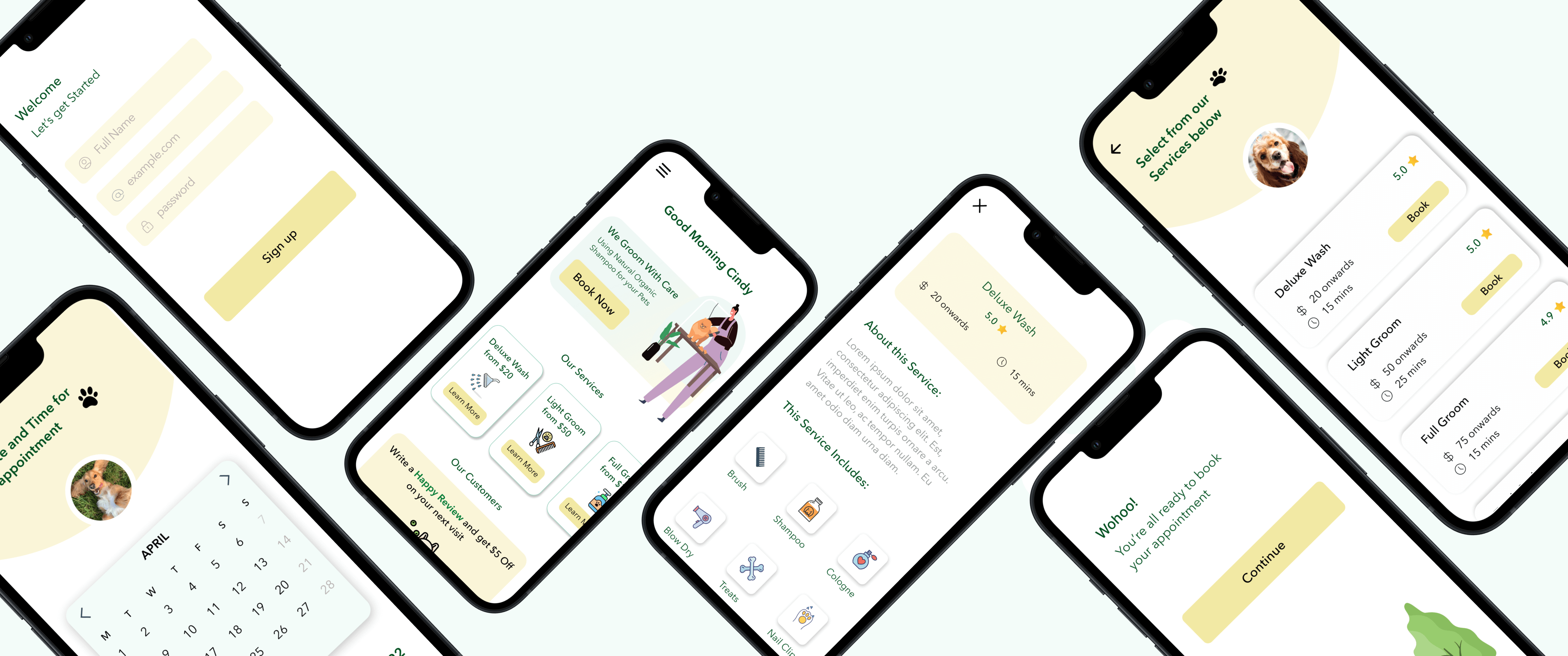
A redesign of a dog grooming app focusing on expanding the customer base through creating user friendly designs.
Timeline
22nd Aug - 19th Sep
My Role
Created insights through usability testing. Built empathy maps and site maps. Paper wireframing and high-fi designs.
Problem
On doing the initial research, I gathered that the information architecture did not follow the common industry patterns.
My goal here was to build a personalized app, enhancing the visual design and making the overall design frictionless for the users.
- The CTA button was missing and the interaction design was inconsistent throughout the website.
- Another major issue was the navigation of the website. The socials were not visible and/or too small to read.
My goal here was to build a personalized app, enhancing the visual design and making the overall design frictionless for the users.
Business Goals
1. Expanding Customer Base: The business wanted a new customer base as they were not getting any traction from their website
2. Customers Drop Off: Due to the missing CTA, around 30% of the customers were leaving the site and not completing the action. This customer frustration just added to the business losses.
2. Customers Drop Off: Due to the missing CTA, around 30% of the customers were leaving the site and not completing the action. This customer frustration just added to the business losses.
Research
I conducted User Interviews with dog owners and presented them the initial homepage of Coco Dog app.
What is the first thing you look at when you book for your dog grooming? Were you able to tell the CTA button from the homepage? Could you tell what services they provide? Can you show me how would you contact Coco Dog Spa from the homepage? Could you show me where the socials of the business are?
Insights
Dissatisified with Visual Design
Exorbitant Information
Absence of CTA button
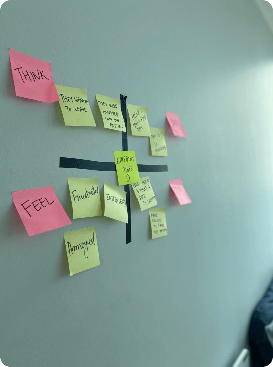
Empathy Maps
In order to summarise and understand my users a bit more, I decided to make empathy maps.

How Might We
After the research, I brainstormed and came up with multiple "How Might We" Ideas.
"How Might We redesign the dog grooming app that allows users to efficiently book appointments without giving them an enormous amount of information."
Design Principles:
Simple: Navigating the website should be as simple as possible. Frictionless: The design should allow users to easily transition from one step to another without the hassle of a dense list of information Ensure a safe place for users' dogs and that they will be in good hands
"How Might We redesign the dog grooming app that allows users to efficiently book appointments without giving them an enormous amount of information."
Design Principles:
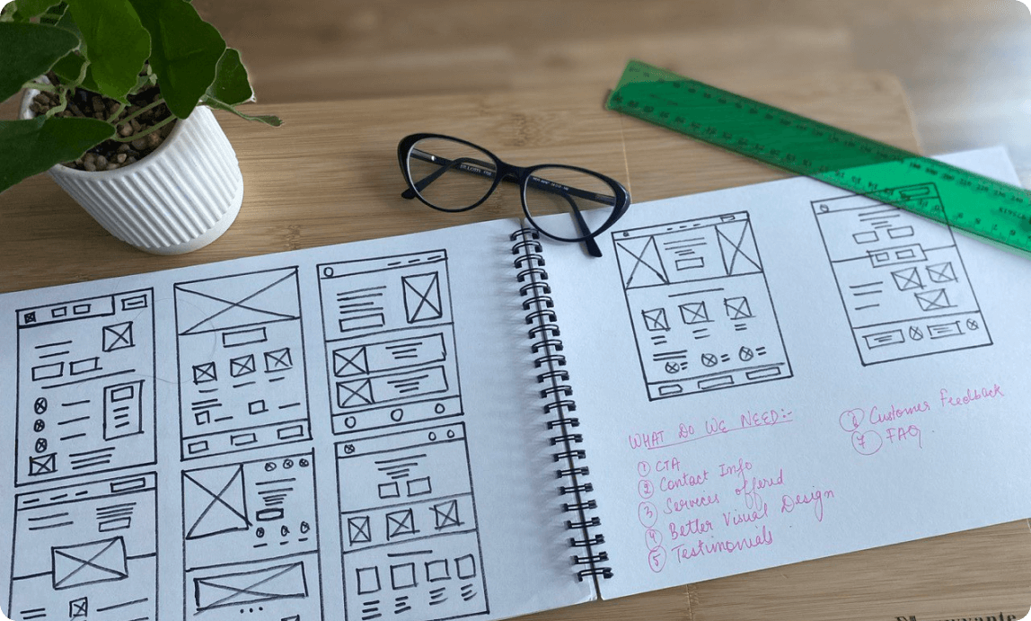
Paper Wireframing

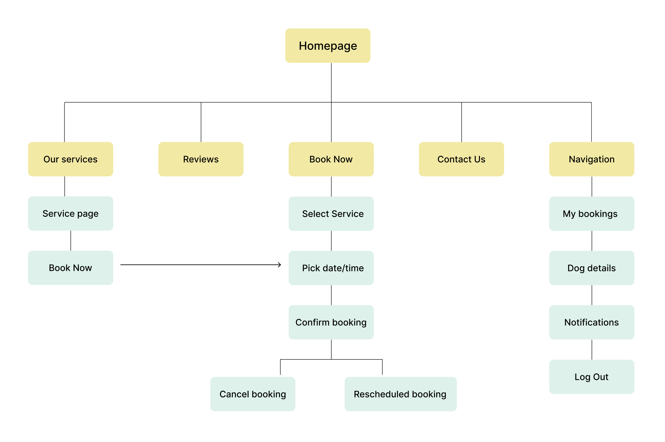
Site Maps

Prototype
Reflection
This being my first project, I'm extremely proud of it. I was unsure if I should add this to my portfolio or not. But I thought it was a good reminder of how far I've come and the progress that I've made over the past couple of months. It was a great learning experience for me to work on this project. However if I had to start on this project again, I would spend more time researching and testing.
From noticing mistakes in my UI to uncovering more UX problems, I'm thankful to have constantly asked for feedback from senior UX designers. I learned how to conduct user interviews and analysing them to create problem statements. With each step of the case study, I got a deeper understanding of the design process. I hope to keep applying my theoretical knowledge to all my future projects.
From noticing mistakes in my UI to uncovering more UX problems, I'm thankful to have constantly asked for feedback from senior UX designers. I learned how to conduct user interviews and analysing them to create problem statements. With each step of the case study, I got a deeper understanding of the design process. I hope to keep applying my theoretical knowledge to all my future projects.