Design System Hero
Design System
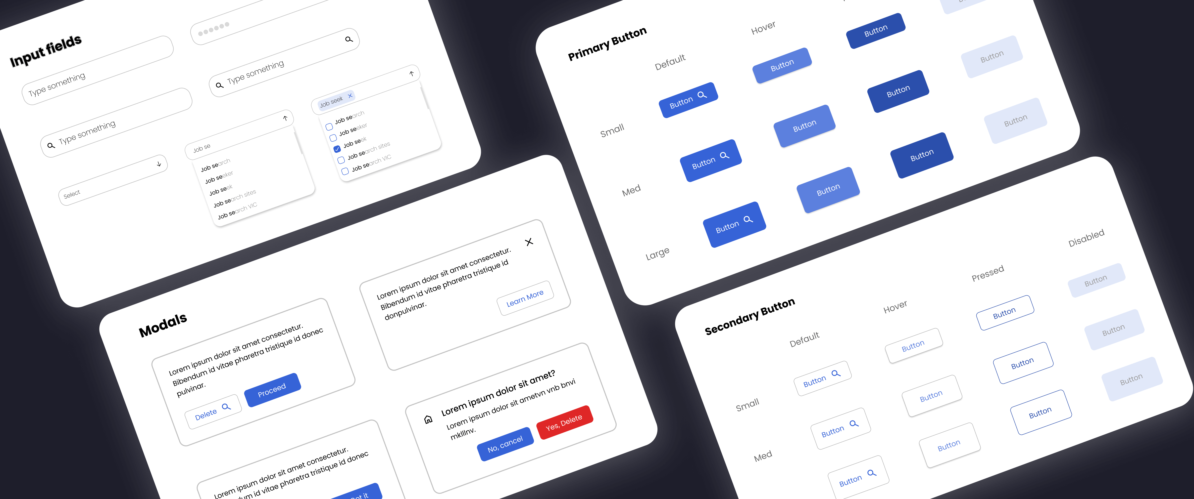
Built a comprehensive set of UI design principles to ensure consistency throughout my projects. These reusable components will promote higher customer engagement and improve the user experience.
Timeline
3rd Oct - 2nd Nov
My Role
Building a design system from scratch, from research to implementation & iteration.
Project Research
This project was initiated with thorough research of competitors following best practices and industry standards. It all narrowed down to the design system followed by these companies, which consisted of style guides, pattern library and component library. I observed the content, structure and visual style to streamline the foundations of my own design system.

However, there wasn’t a one-size-fits-all solution to building a design system. Each of the competitors followed a set of guidelines with their own personal touch to it. I started going through multiple design iterations, starting from low fidelity wireframes to gradually refining the designs.
Atomic Design Methodology
In order to understand design systems better, I explored the concept of atomic design introduced by Brad Frost. This hierarchical approach draws inspiration from chemistry, where atoms combine to form molecules, molecules combine to form organisms, and so on. By using this method, UI elements are broken down into resuable components that can be combined to create more complex designs.

This scalable approach allows designers and developers to collaborate more efficiently and maintain a consistent user interface by reusing these modular components.
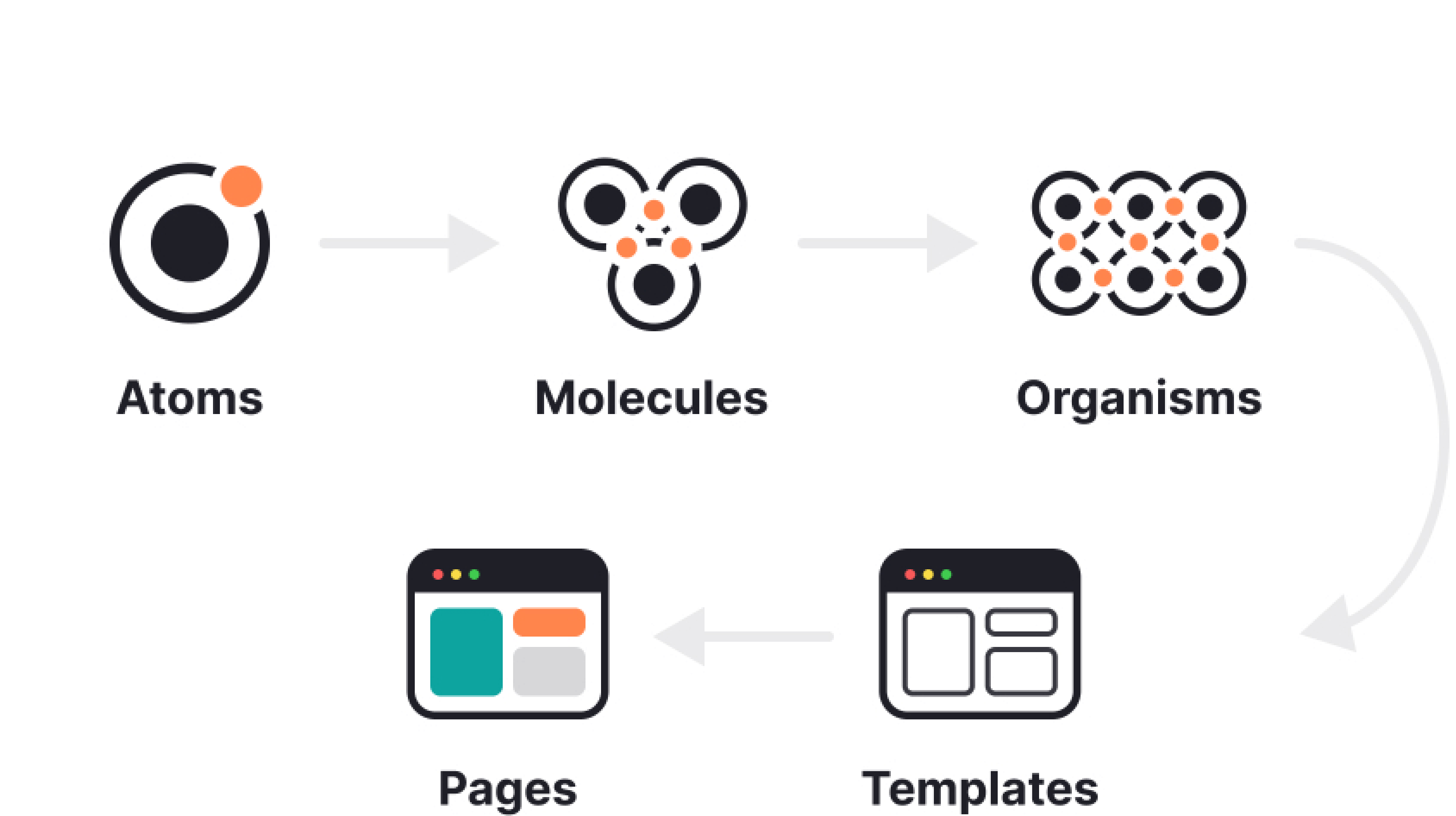
Design Methodology Diagram
Colour
In a design system, color defines the overall visual appearance of a product. I started by defining a color palette and establishing token values. These variables allow for quick updates across the design system by clearly defining each of the colors.

Creating different states for each of the colors ensured a consistent and cohesive visual language. Maintaining the hue as the same, I adjusted the saturation and brightness, depending on how intense I wanted my color palette to be.
Primary Color
Primary 50
#413FC2
Primary 40
#4947DA
Primary 30
#514FF2
Primary 20
#C9C8FB
Primary 10
#E5E5FD
Error Color
Error 50
#B21F1F
Error 40
#C92323
Error 30
#DF2727
Error 20
#F5BCBC
Error 10
#FADFDF
Success Color
Success 50
#117B0F
Success 40
#138B11
Success 30
#159A13
Success 20
#B6E0B6
Success 10
#DCF0DC
Warning Color
Warning 50
#BA6B23
Warning 40
#D27928
Warning 30
#E9862C
Warning 20
#F8D9BE
Warning 10
#FCEDDF
Information Color
Information 50
#2B4FAC
Information 40
#3159C2
Information 30
#3663D7
Information 20
#C1CFF3
Information 10
#E1E8F9
Neutral Color
Neutral 50
#131313
Neutral 40
#292929
Neutral 30
#363636
Neutral 20
#C1C1C1
Neutral 10
#E1E1E1
Typography
The next step in creating a polished design system was to build a well defined typography system. I wanted a playful, modern yet professional looking typeface. Poppins stood out to me with its clean and natural style. It’s excellent readability, balanced proportions and over 20 styles makes it a popular choice in UX/UI design.

I calculated my font weight on a visual calculator called Typescale. Selecting my base size as 16, typescale determined the rest of the weights and created a hierarchy within my typography scale.
Headings
Hello
Heading 1
Typeface: Poppins
PX: 47.78
Weight: Bold
Line height: 50
Hello
Heading 2
Typeface: Poppins
PX: 39.81
Weight: Bold
Line height: 50
Hello
Heading 3
Typeface: Poppins
PX: 33.18
Weight: Bold
Line height: 40
Hello
Heading 4
Typeface: Poppins
PX: 27.65
Weight: Bold
Line height: 40
Body
Hello
Body 1
Typeface: Poppins
PX: 19.2
Weight: SemiBold
Line height: 24
Hello
Body 2
Typeface: Poppins
PX: 16
Weight: SemiBold
Line height: 24
Hello
Body 3
Typeface: Poppins
PX: 13.33
Weight: SemiBold
Line height: 24
Elevation
I built four elevation styles for a distinct hierarchical relationship between design elements. With each level, I added drop shadow by emphasising the blur effect and elevating the shadow along the Y-axis. I raised the shadow color slightly to create a sufficient contrast between surfaces.

Establishing a better visual hierarchy and layering UI elements is part of a user centric design system. Elevation contributes to the overall user experience by providing a sense of depth and realism in the digital space.
Elevation 1
Hex: #000000
Alpha: 2%
X: 0, Y: 1, B: 1, S: 0
Hex: #000000
Alpha: 4%
X: 0, Y: 2, B: 4, S: 0
Elevation 2
Hex: #000000
Alpha: 4%
X: 0, Y: 1, B: 4, S: 0
Hex: #000000
Alpha: 8%
X: 0, Y: 4, B: 10, S: 0
Elevation 3
Hex: #000000
Alpha: 4%
X: 0, Y: 2, B: 20, S: 0
Hex: #000000
Alpha: 4%
X: 0, Y: 8, B: 32, S: 0
Elevation 4
Hex: #000000
Alpha: 6%
X: 0, Y: 8, B: 20, S: 0
Hex: #000000
Alpha: 12%
X: 0, Y: 24, B: 60, S: 0
UI Components
The final building block of my design system was to build reusable UI components. A design system is incomplete without these group of elements, allowing to create scalable and accessible designs across any project.
Buttons
I started by creating various button states, each indicating a different stage of interaction with the user. I designed my primary and secondary button, adhering to the typography scale and color palette. In addition to that, I added variants to each of my components representing different sizes and iconography.
Hey! My extensive button grid is currently in development 👷🏾‍♀️ but you can see them used in the Modals section!
Modals
Modals are pop up windows providing special tasks, interactions or information. I designed four basic modal styles representing different user options. I added a light stroke to visually distinguish the boundaries of the modal.
Option Dialogue Modal
Lorem ipsum dolor sit amet consectetur. Bibendum id vitae pharetra tristique id donec pulvinar.
Dismissible Modal
Lorem ipsum dolor sit amet consectetur. Bibendum id vitae pharetra tristique id donpulvinar.
Checkbox Modal
Lorem ipsum dolor sit amet consectetur. Bibendum id vitae pharetra tristique id donpulvinar.

Don’t show this again

Icon and Delete Modal
Lorem ipsum dolor sit amet?
Lorem ipsum dolor sit ametvn vnb bnvi mklllnv.
Icons/Avatars
To ensure consistency in the icon family, I set the icon size to 24 x 24 with black and blue colors from the color palette. These icons represent specific actions within the interface.
Done
Heart
Search
Home
Cancel
Right arrow
Left arrow
Delete
Checkbox Ticked
Checkbox Unticked
Toggle On
Toggle Off
Radio On
Radio Off
Download
Input fields
These interactive elements allow users to enter and submit data. I designed the most commonly user input fields with elements including text and icons.
Hey! My extensive collection of inputs are currently in development 👷🏾‍♀️ check back here soon!
Takeaway
A consistent and a well crafted design system will facilitate to generate efficient solutions to user problems. This project enabled me assimilate information on UI elements and their importance in design. I plan to update my past projects and portfolio with this newly built system.

I encountered a few challenges while working on this project, including maintaining consistency across all components and ensuring that all components adhere to accessibility guidelines. Understanding and learning from comprehensive design systems like Material, Polaris, helped me overcome these issues. To move forward with my designs, I will continue to build more UI components including chips, cards, snackbars, tooltips etc. Finally, I plan to conduct another round of research to fully grasp every aspect of a design system and maintain consistency.