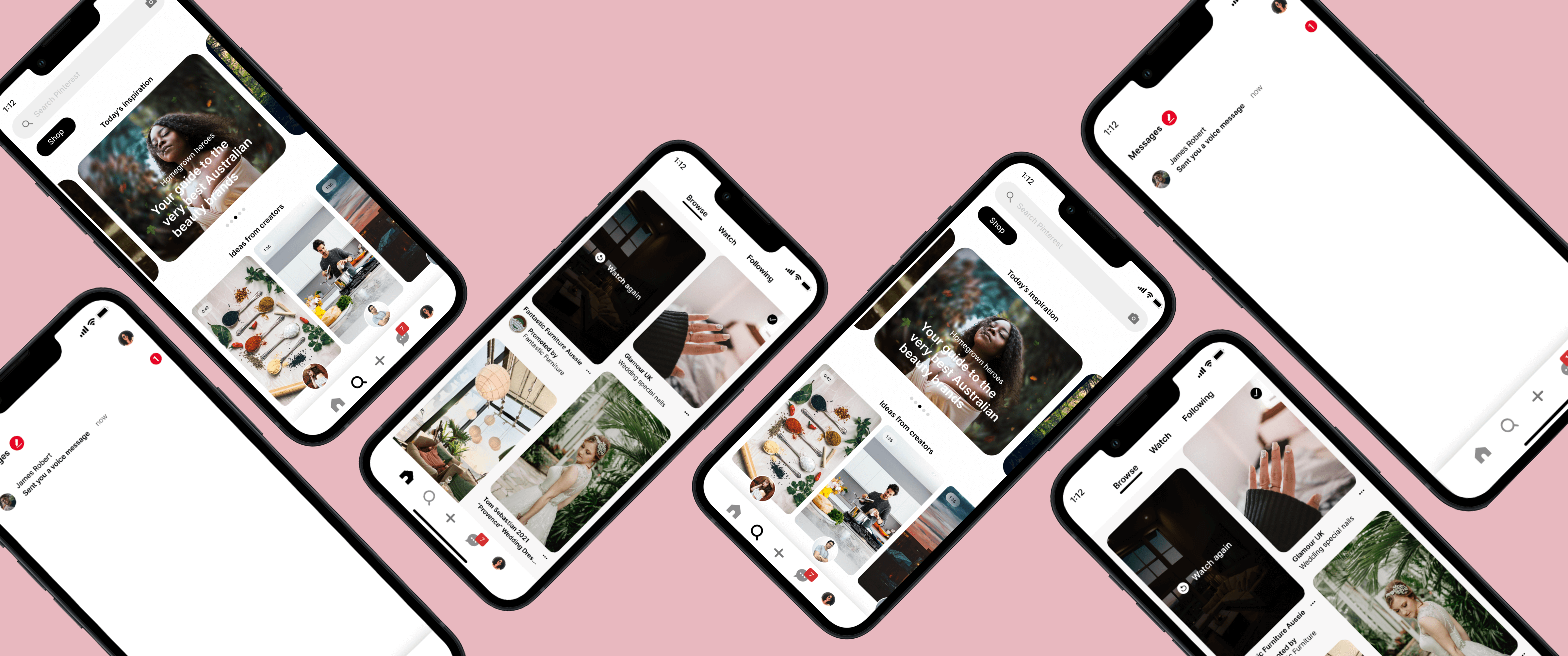
Pinterest Redesign
This project focuses on eliminating the user pain points. These redesigns allows better usability by adding simpler designs and reducing user's cognitive load.
Timeline
1st - 12th Nov
My Role
Building personas based on the user research. Conducted usability testing and redesigned the solutions.
Overview
Pinterest is a great app for setting up your vision boards digitally. We can discover and explore new ideas on Pinterest. By "pinning" these ideas, we can save them as references. These can include images, videos or even links that will redirect us to a detailed explanation of that product.
At current, there are over 433 million people on Pinterest, including me! It is a great place to find inspirational ideas for literally anything. Organising boards is the key element of Pinterest which makes it stand out. The reason I decided to redesign Pinterest was that as a regular user, I still don't quite understand certain Pinterest features. Every time I use Pinterest, I think to myself "If only I could change this feature, it would make Pinterest clutter free or make thing easier for users"
At current, there are over 433 million people on Pinterest, including me! It is a great place to find inspirational ideas for literally anything. Organising boards is the key element of Pinterest which makes it stand out. The reason I decided to redesign Pinterest was that as a regular user, I still don't quite understand certain Pinterest features. Every time I use Pinterest, I think to myself "If only I could change this feature, it would make Pinterest clutter free or make thing easier for users"
Problem
There are certain issues that I, as a user, have with the Pinterest app. Through my research, I found out that there was a monthly active user drop from 478 million to 431 million during 2021. I went on Reddit and saw a great deal of user complaints. I decided to do usability testing and conduct interviews to reach to the core of the problem.
Users
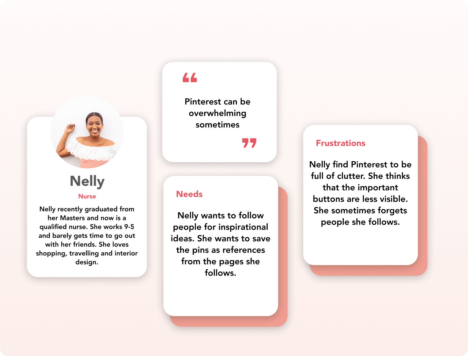
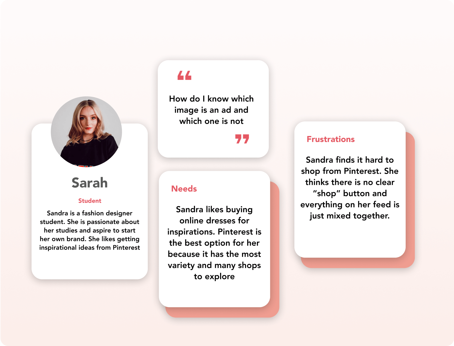
Personas
Usability Testing
In order to understand the problem better, I decided to conduct usability testing on 5 users. I decided to give them a storyline based on the above personas. I noted down their responses and frustrations during this testing.
- "You want to buy a gift for your partner using Pinterest. Could you please show me the procedure you would follow to do this task"
- "After deciding on the gift, you want to forward the pin to your friend, asking them for suggestions. How would you do that"
Pain Points
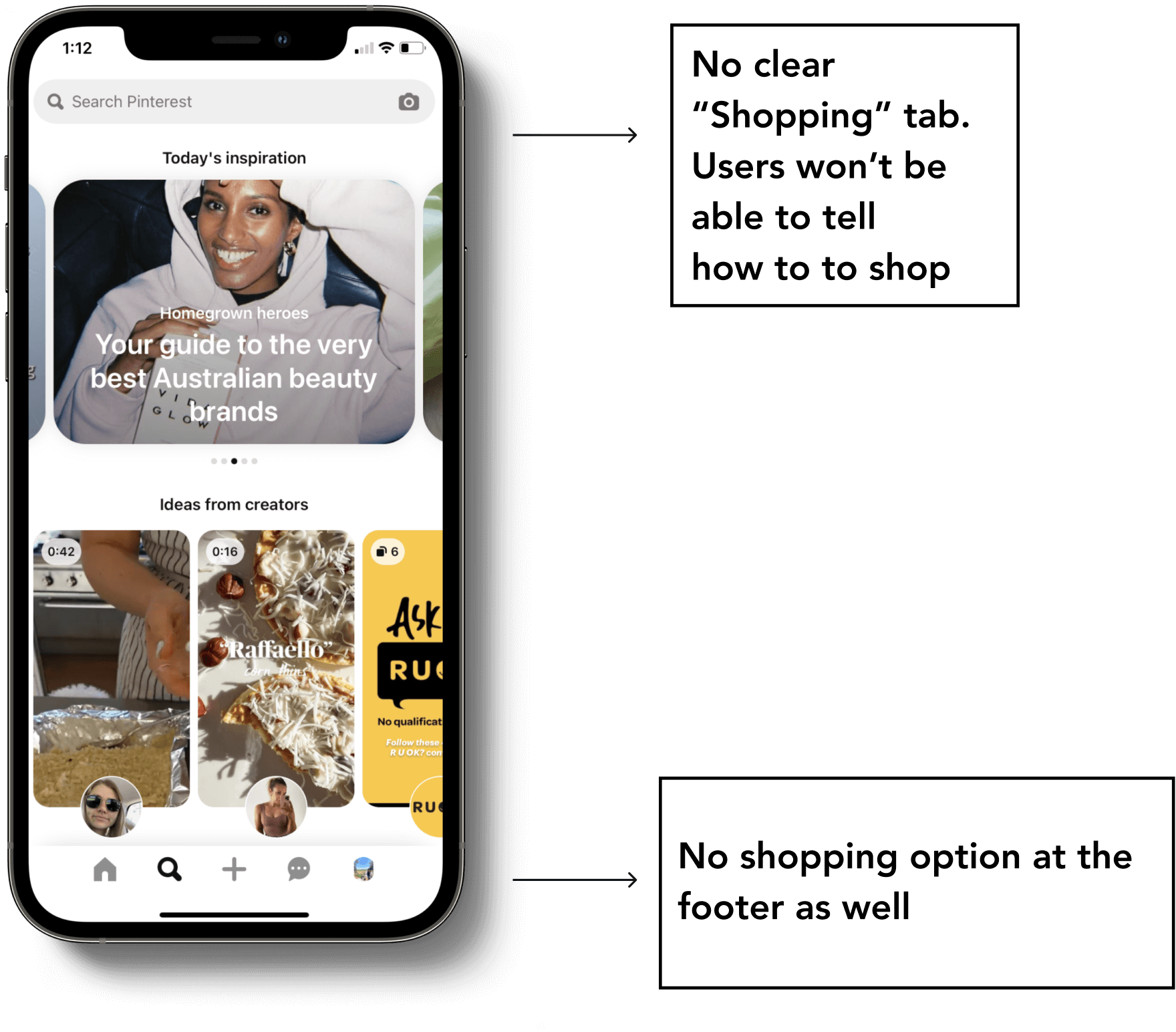
No Shopping Clarity
The main issue with the users was that shopping on Pinterest is not easy. They couldn't find the "Shopping" tabs. When I went on Pinterest to look this up, I faced the same problem too.
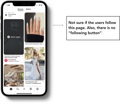
Pages followed
While scrolling on the home page, users were not able to tell whether they follow the page or not. Only when they click on the image, the following status appears. This question was not part of my usability testing but most of the users had this problem so I decided to include in my case study.
Unclear Messaging
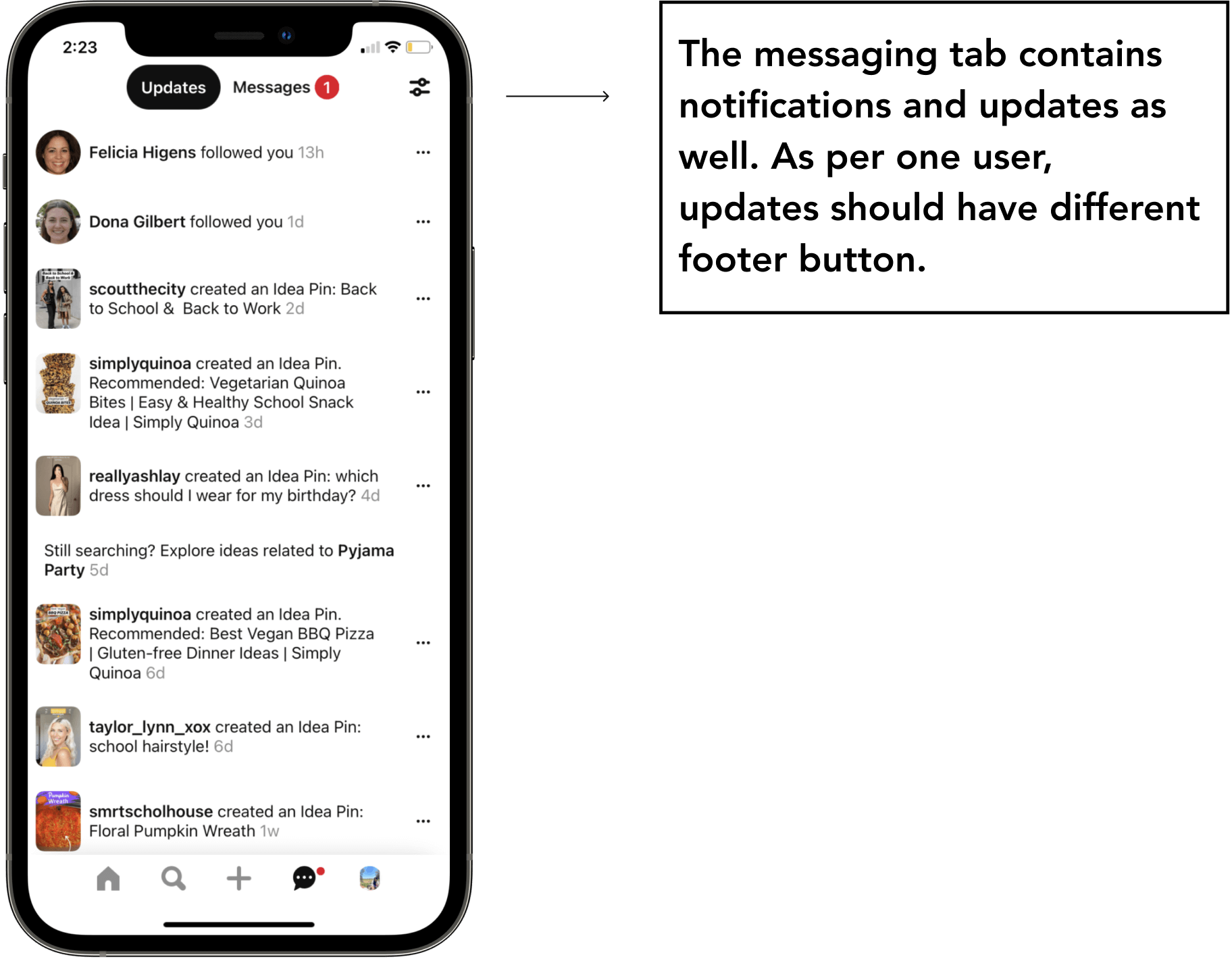
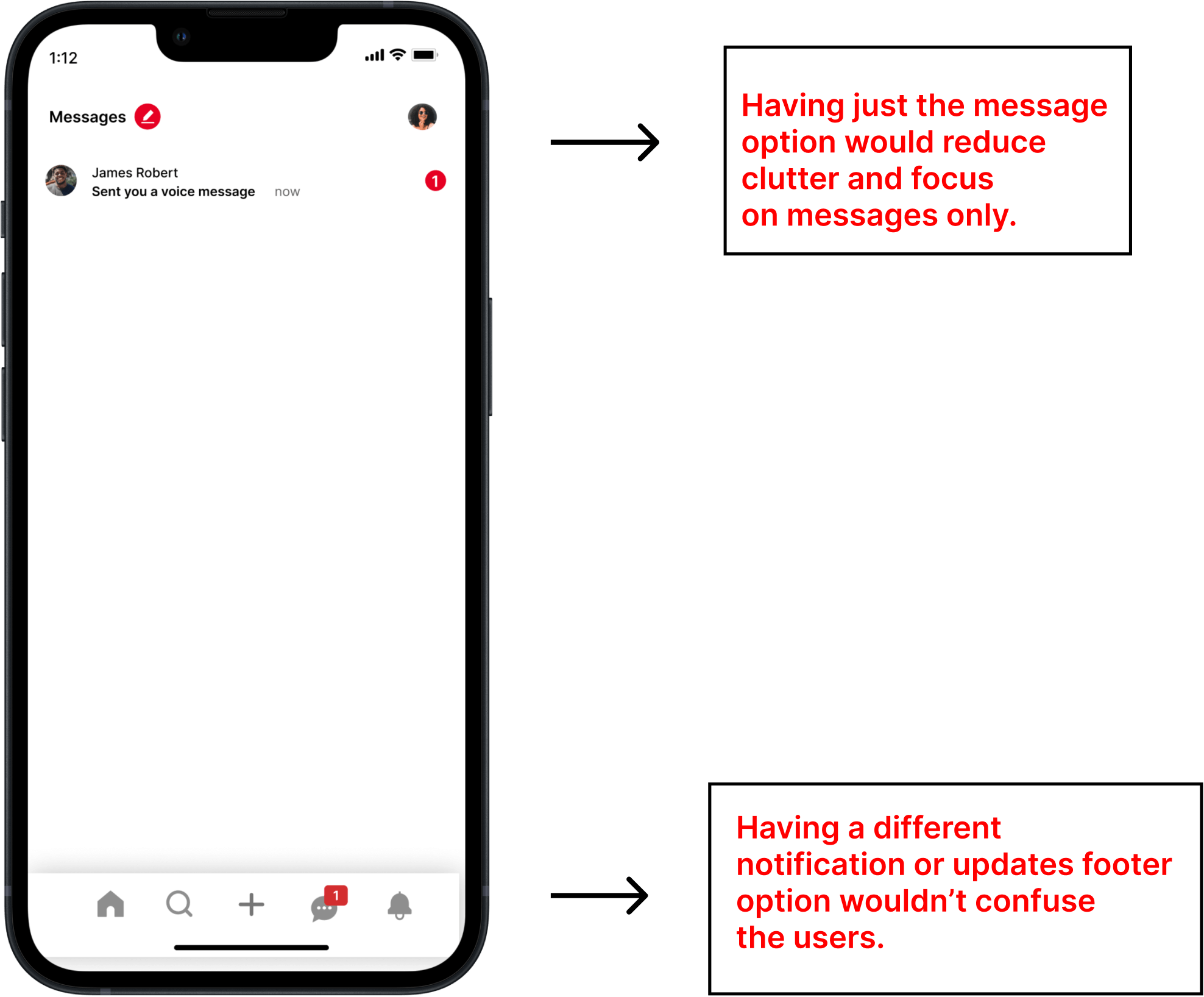
Pinterest has the messaging icon in the footer. However, "updates" option is also included within the messages, which can be confusing for some users. Although this wasn't a big issue but I decided to resolve this.
Design Solutions / Redesign
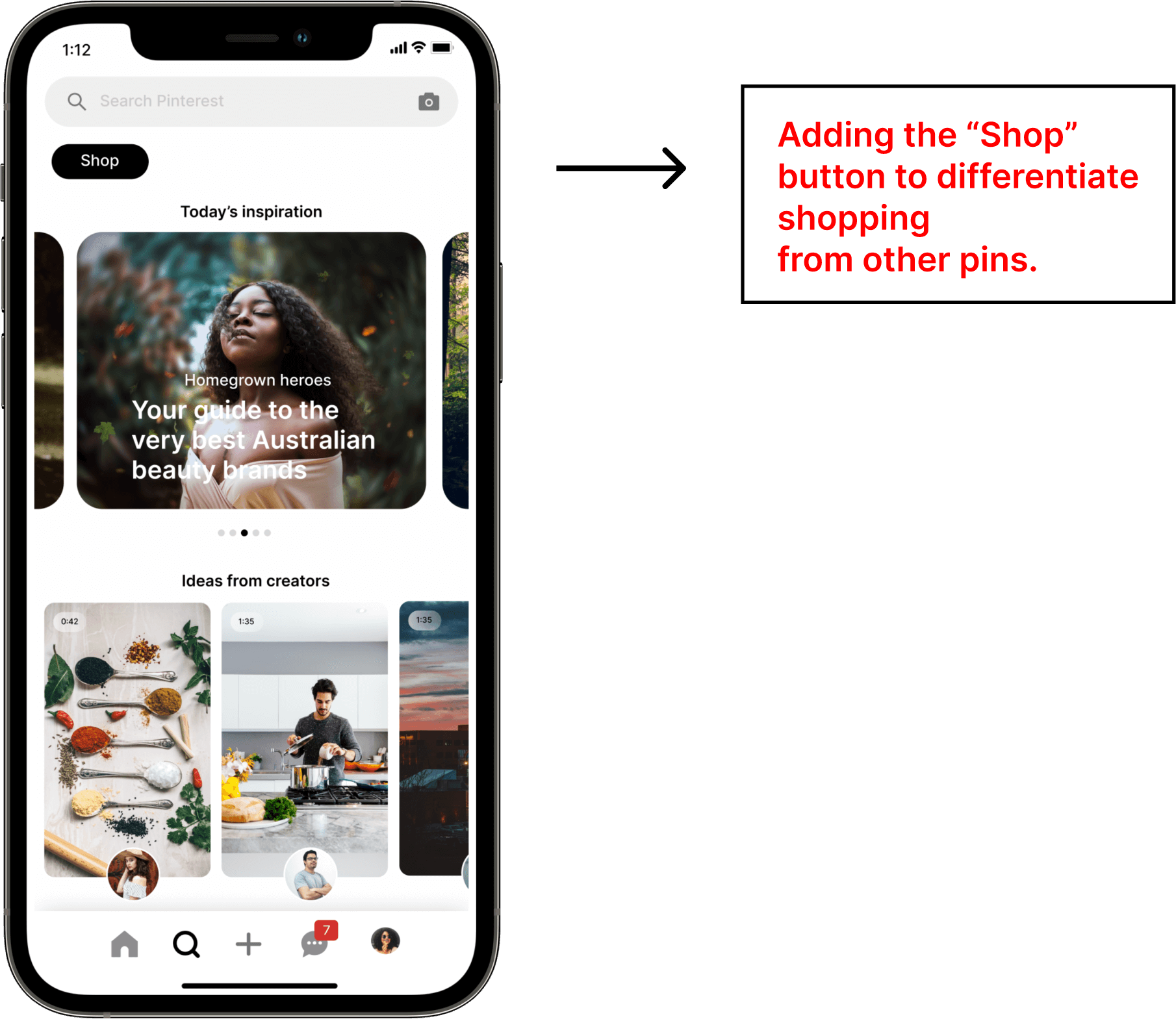
Adding the shopping button
Users don't have to scroll on the explore page anymore. The shoppers would simply click on the button which would take them to the shopping page. This would avoid any confusion.
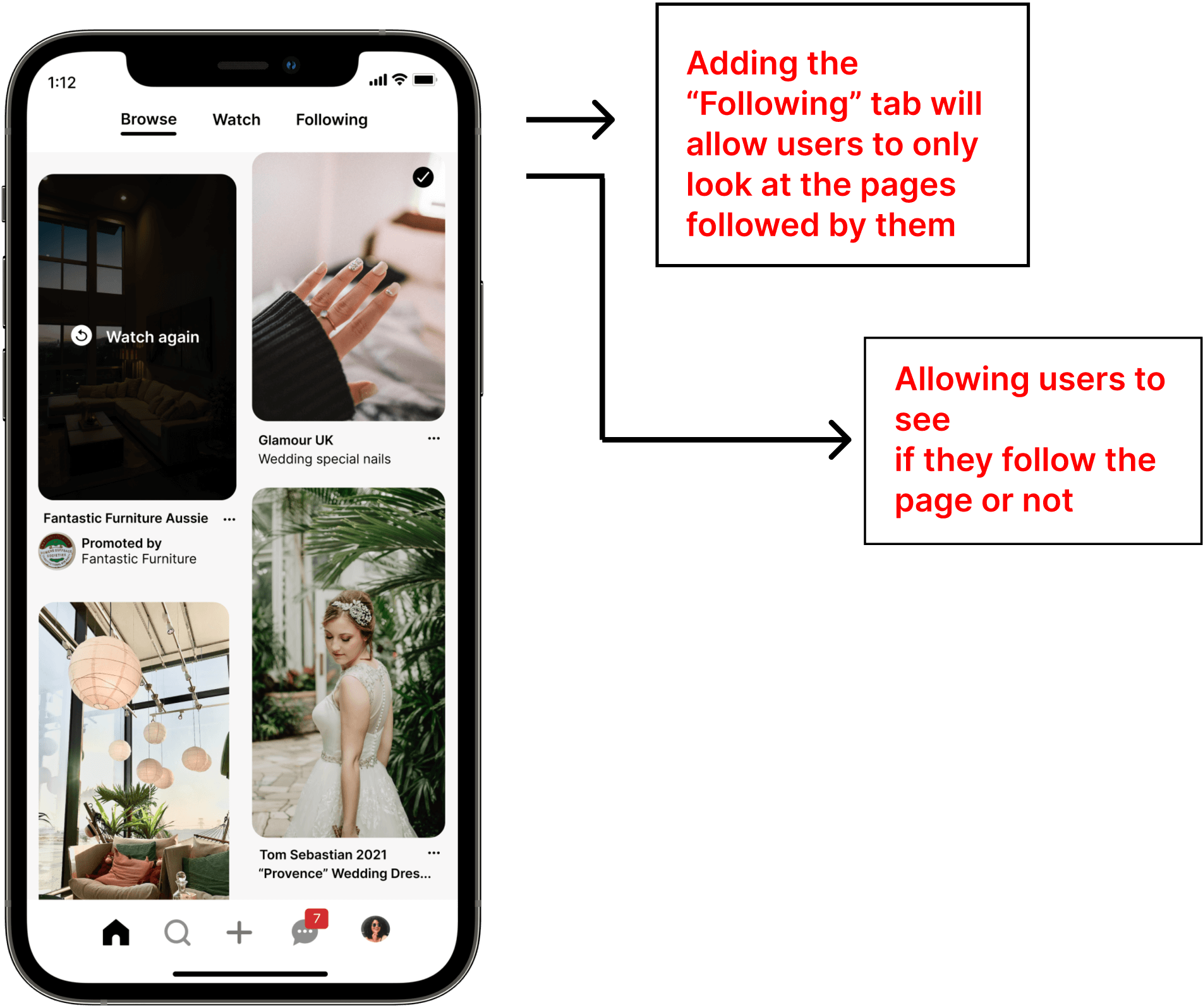
Adding the following tab
Users can access to their following option from their profile page. However, when scrolling, users weren't able to figure out if they follow their page or not.
Unclear Messaging
Users didn't really have problems sending messages to their friends. The only issue was that most of them were frustrated that messages and notifications were under the "messages tab". I decided to redesign this part because I want the users to have a pleasant experience while using the app.
Conclusion
I have been using this app for years and never found anything wrong with it. But for this project's sake, I did a full analyses on Pinterest, talked to my friends, conducted interviews and concluded that there are a lot of minor pain points that Pinterest should address. Changing these little details might lead to higher user engagement. If I had to redo this project, I would probably focus on just one feature rather than trying to solve multiple pain points. This would allow me to design a better interactive user flow.